The visible area changes the pattern
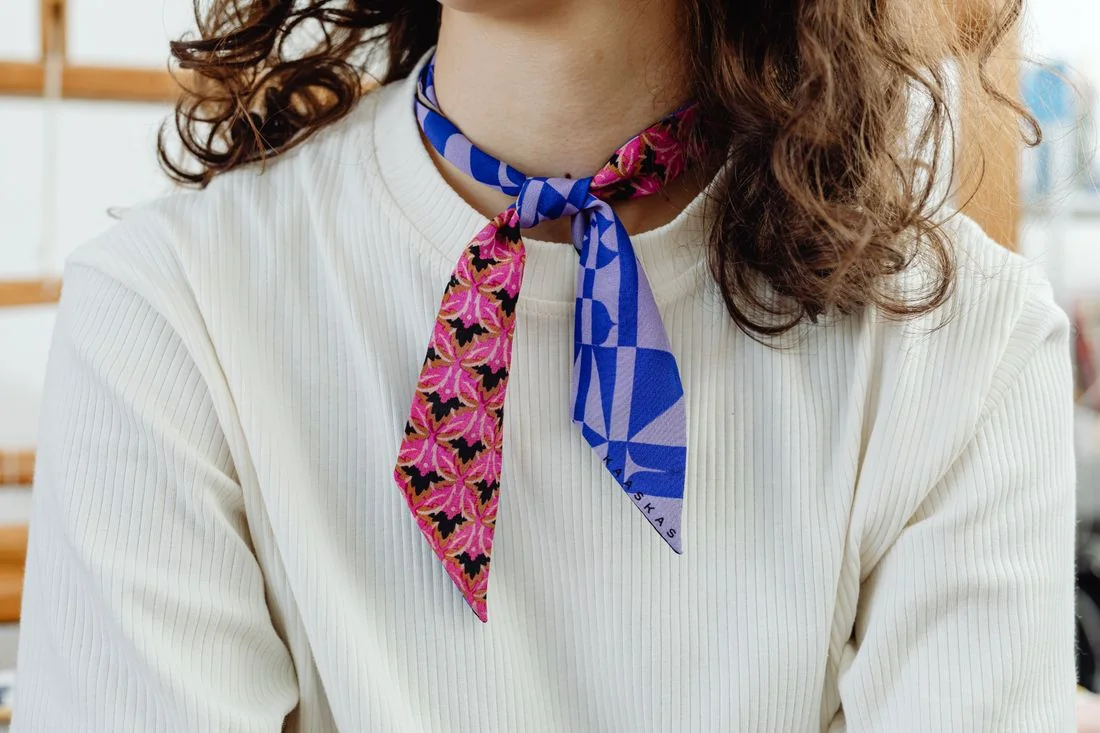
Spread the scarf out first, then fold it into the arrangement you intend to wear. A large floral print may look almost abstract when shown as a narrow strip. A dark border can become more visible than the central motif. Judge the version that will actually be worn, rather than only the scarf laid out flat.
If the combination seems too colourful to you, begin by reducing the visible area. A loose, narrow arrangement shows less pattern than a large triangle across the chest. Avoid making the knot so tight that you repeatedly want to loosen it. The arrangement needs to work beyond a photograph.
Pick up a colour already present
Look for a colour in the scarf that also appears in the top, trousers or shoes. It does not need to match precisely. Dark blue within a print can connect to jeans while the rest of the scarf remains much lighter. This repetition is one possible starting point, not a compulsory recipe.
Against an entirely neutral outfit, the scarf can also stand as a separate colour accent. Then decide whether you still want other noticeable accessories. Keep the bag and jewellery unchanged for the first comparison; otherwise it becomes difficult to tell whether the difference comes from the scarf or the other items changed at the same time.
Consider movement and the day's plans
A soft scarf falls differently from a stiffer one of the same size. If you have both, arrange them over the same top. One may form narrow folds while the other remains a larger, more defined surface. These differences can matter more than following a supposedly correct colour rule.
Try the jacket over the scarf and pick up your bag. Ends that continually disappear under a strap may need a different length or position. Keep an arrangement that you can repeat without lengthy adjustments. A quick look at your own outfit photograph can later help you recover the particular fold you liked, rather than starting again with the entire scarf spread across the bed.